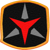
Narathkor wrote:It seemed like you wanted more of a logo and really didnt like the scrollwork/text at all, so lets try something different and see what you think. It is much more simple yet keeps the fabric look and scales much better to the small icon. It also uses more of the pixel space as it is more square.

First of all, sorry for my late response!
I really like what you took the initial idea to in this round, based on the feedback! The Tri-shape reflects the Creed and the intentional "imperfection" at the lower left makes it look like an actual sewn badge!
My critique mostly concerns the duplication of the Tri-shape. I personally think it would be stronger if the red Tri-shape was removed and a Red C was placed instead. The C would size-wise be of the same circumference as the red Tri-shape atm. - the grey Tri-shape would be fleshed out and "meet in the middle" but there would be black borders where the red C intersects the Tri-shape (kindda like you have it with the red tri-shape and the grey one atm, perhaps a little smaller in the big badge.
I really like the icon and I also think that the red C would make a stand-out small icon aswell.
I would also like to see some more detail in the black field, perhaps a few stars - but nothing too overwhelming (I know, I'm difficult!)
Also, could you perhaps make 2-3 different tries/implementations of the ideas above, because that would help the process, I think

Hmm.. also thought of perhaps a color-change, so the border would be black thread, dark red background (like eg. the Post Reply button on the forum), black intersection borders and a bright red C (like the red Tri-Shape)
I would like to see both "color schemes" if you can manage it?








 that's for 24px icon
